In the bustling world of retail, shelf labels serve as silent yet crucial guides for shoppers navigating through countless products. Whether in grocery stores, hardware shops, or boutique retailers, these small but mighty pieces of information play a pivotal role in the shopping experience. Understanding how to design shelf labels that effectively communicate essential product details while maintaining visual clarity can significantly impact both customer satisfaction and operational efficiency.
The art and science of shelf label design encompasses multiple factors, from typography choices to color schemes, all working together to ensure information is instantly accessible to shoppers of all ages and abilities. As retail environments become increasingly competitive, the need for clear, professional shelf labels has never been more critical.
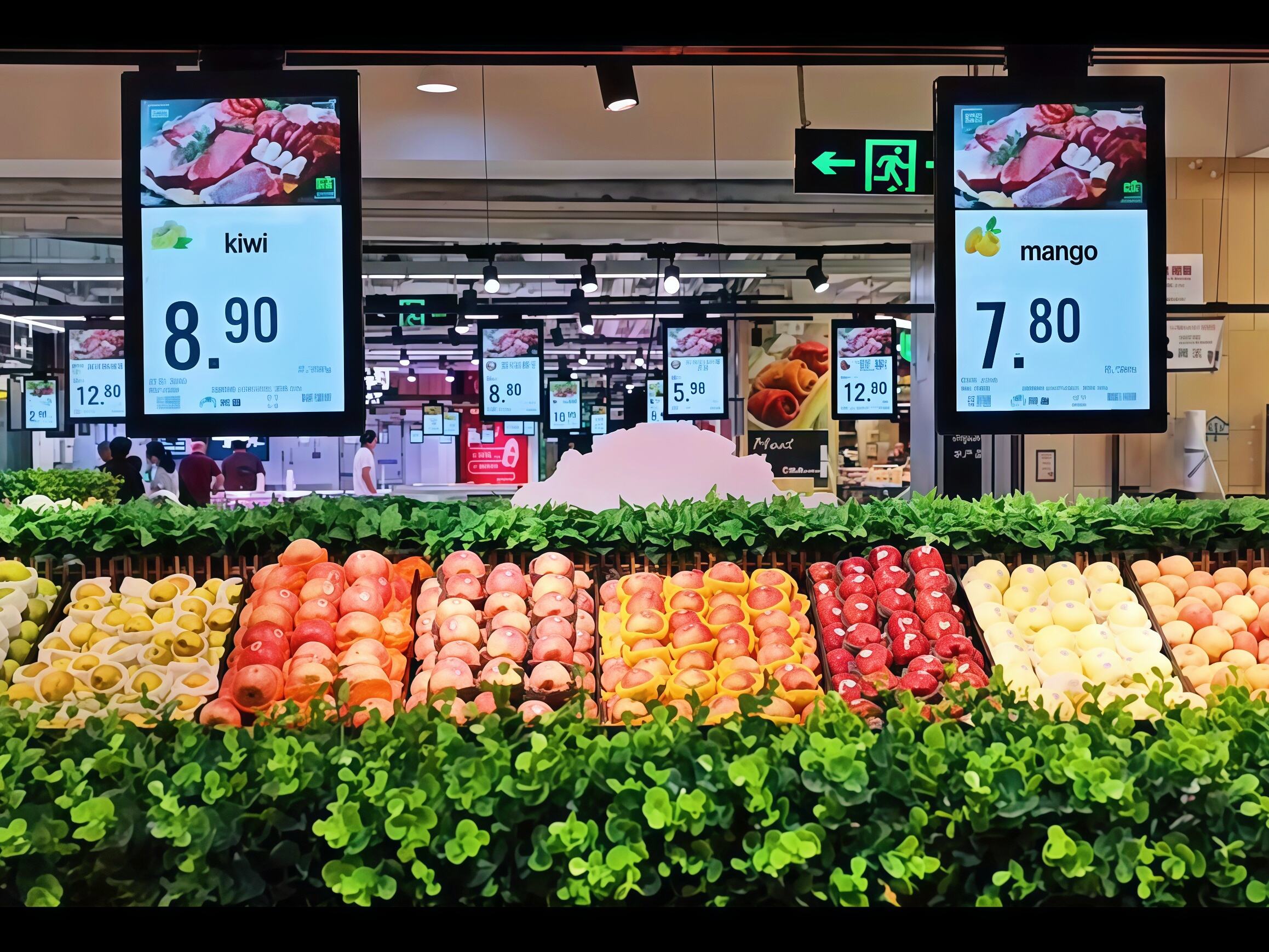
The foundation of readable shelf labels begins with appropriate typography. Sans-serif fonts like Arial, Helvetica, or Open Sans are ideal choices as they maintain clarity even at smaller sizes. The optimal font size typically ranges between 10-14 points for primary information, while secondary details can be slightly smaller but never less than 8 points.
Font weight also plays a crucial role - using bold typefaces for prices and product names helps these essential elements stand out. However, avoid using more than two font styles on a single shelf label to maintain visual harmony and prevent confusion.
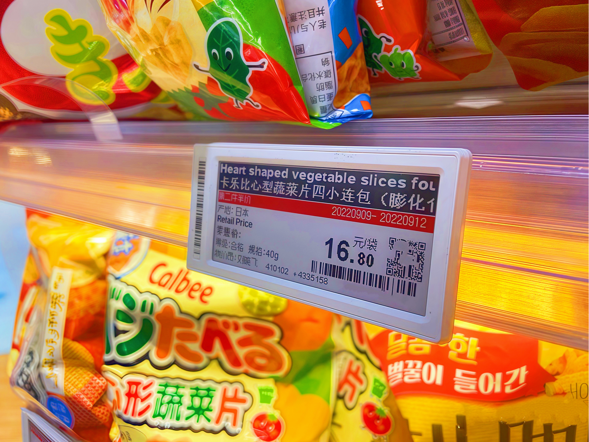
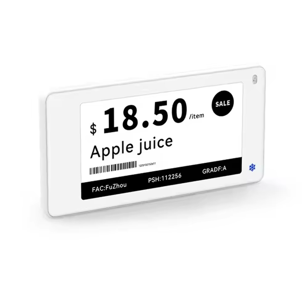
High contrast combinations ensure shelf labels remain legible under various lighting conditions. Black text on white or light backgrounds remains the most effective choice for general information. When using color for categorization or highlighting special offers, maintain a minimum contrast ratio of 4.5:1 for optimal readability.
Consider the store's lighting system when selecting background colors. Some colors may appear different under fluorescent lights compared to LED lighting, potentially affecting label visibility. Testing labels under actual store conditions helps ensure consistent readability throughout the shopping environment.
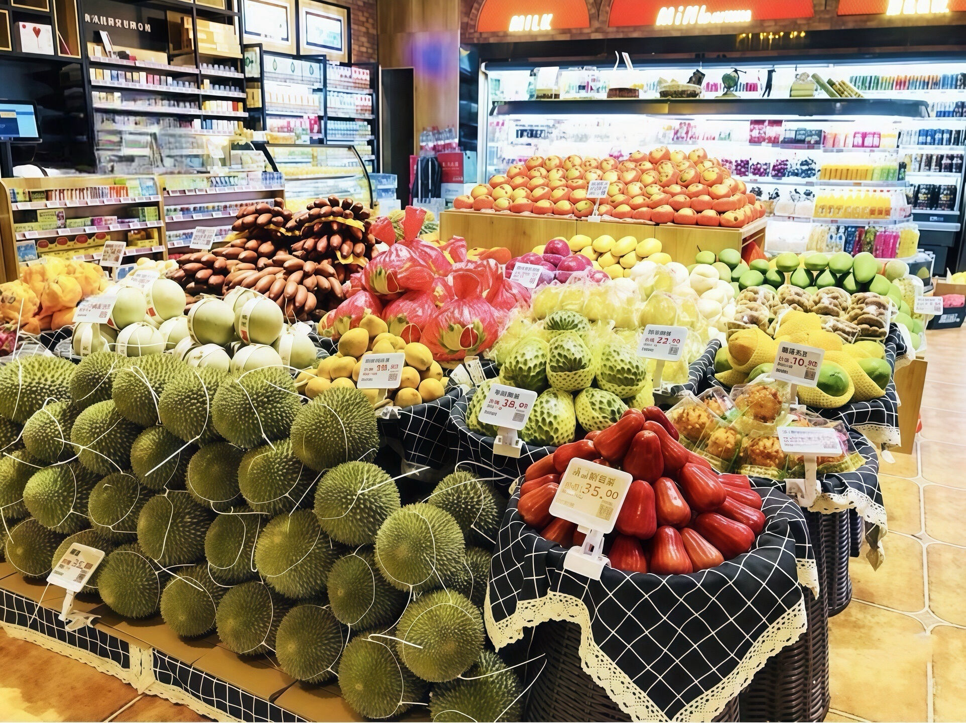
Strategic placement of key information follows natural eye movement patterns. Price points and product names should occupy the most prominent positions on shelf labels. For Western markets, this typically means the upper left portion of the label, as readers naturally begin scanning from this position.
Create clear visual separation between different information types using white space or subtle dividing lines. This helps shoppers quickly locate specific details without having to process all the information simultaneously.
Additional information such as unit pricing, product codes, or dietary information should be arranged in a logical secondary tier. Using slightly smaller font sizes and strategic spacing helps maintain a clear hierarchy while ensuring all necessary details remain accessible.
Consider implementing a standardized layout template for consistent information placement across all shelf labels. This familiarity helps customers quickly locate specific details regardless of their location within the store.
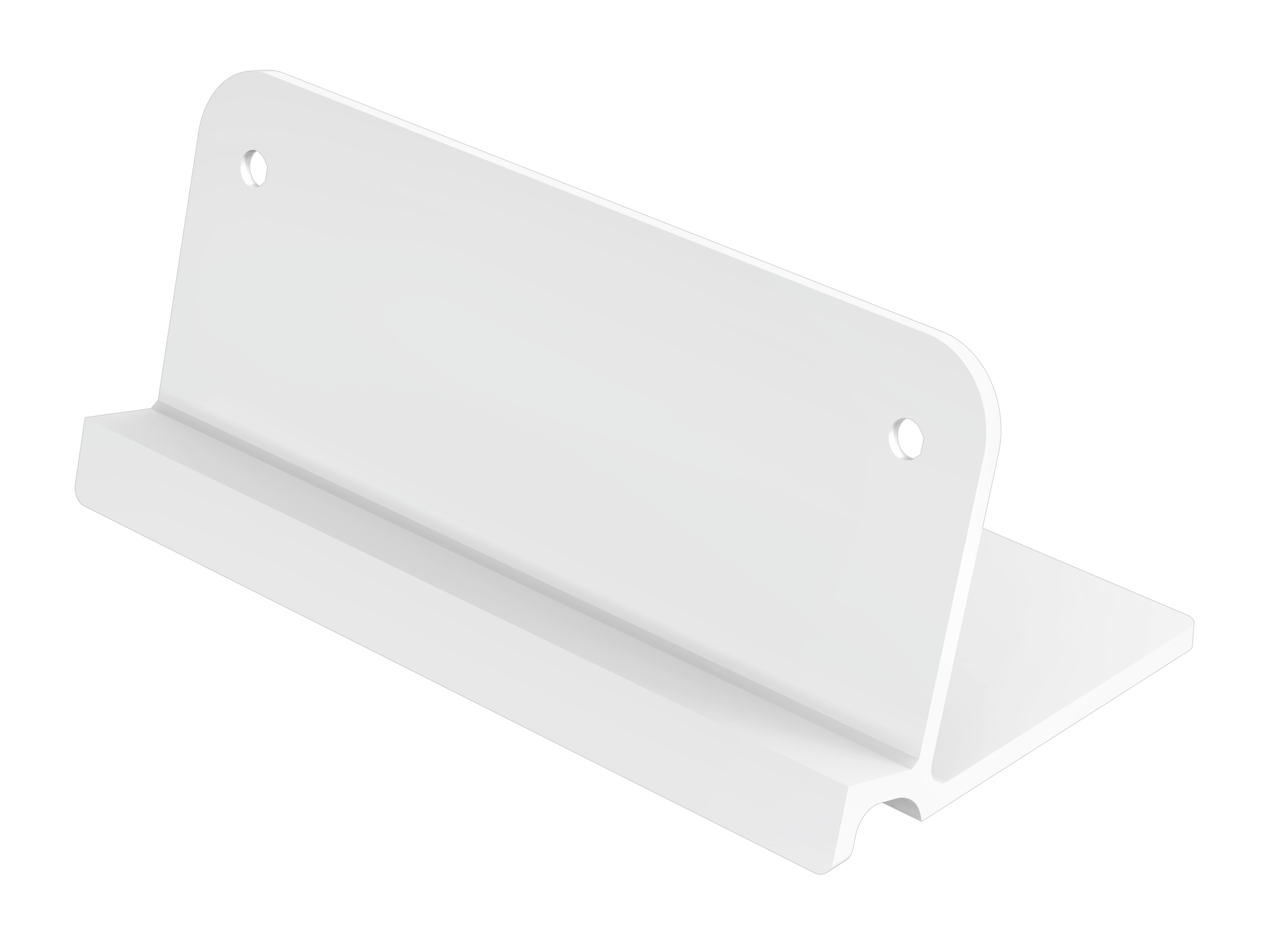
The physical properties of shelf labels significantly impact their longevity and performance. Non-glare materials prevent light reflection that could impede readability. Durable synthetic materials resist moisture, temperature changes, and regular handling, ensuring labels maintain their appearance over time.
Consider environmental factors when selecting materials. Labels in refrigerated sections require different specifications compared to those in ambient temperature zones. UV-resistant materials prevent fading in areas exposed to natural light or strong artificial illumination.
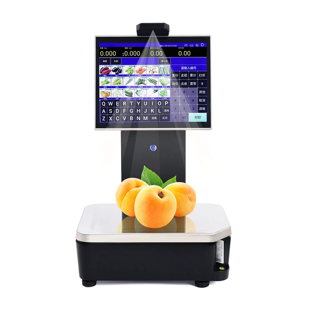
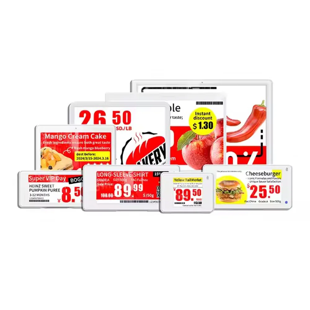
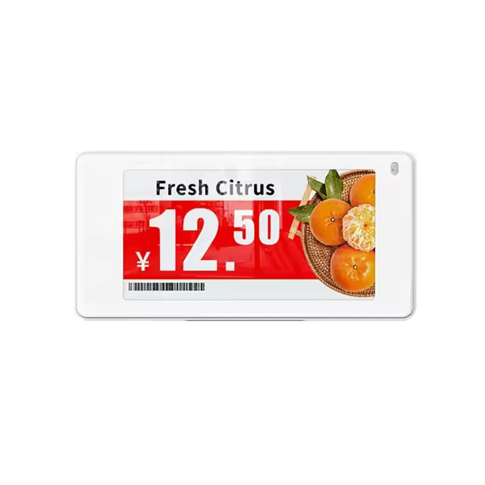
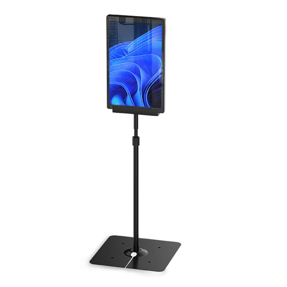
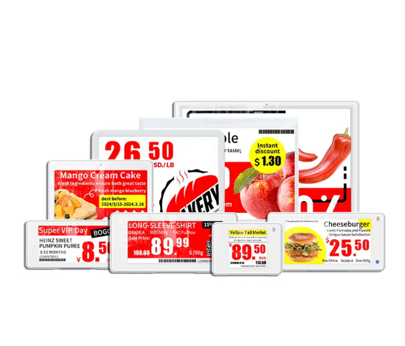
High-resolution printing ensures crisp, clear text and sharp barcode reproduction. For digital shelf labels, screen resolution and refresh rates impact readability. Whether using traditional or electronic displays, maintain consistent quality standards across all shelf labels to ensure uniform visibility throughout the store.
Regular quality control checks help identify and replace damaged or faded shelf labels before they impact the shopping experience. Implement a systematic review process to maintain label integrity across all store sections.
Proper installation of shelf labels ensures optimal visibility and longevity. Position labels at eye level when possible, maintaining consistent heights within each shelf section. Account for various shopping scenarios, including customers viewing labels while standing, bending, or using shopping carts.
Consider the viewing angle and distance when mounting shelf labels. Labels should be easily readable from both straight-on and slight angles, accommodating different customer heights and positions in the aisle.
Establish a systematic approach to label maintenance and updates. Regular cleaning prevents dust accumulation that could affect readability. For electronic shelf labels, implement protocols for battery monitoring and replacement to prevent display failures.
Create a schedule for routine label inspection and replacement. This proactive approach helps identify worn or damaged labels before they become problematic for customers or staff.
The optimal font size for primary information on shelf labels is typically between 10-14 points, with secondary information no smaller than 8 points. This ensures readability while maintaining efficient use of label space.
Traditional paper shelf labels should be replaced when they show signs of wear, fading, or damage, typically every 3-6 months depending on environmental conditions and handling frequency. Electronic shelf labels require replacement based on battery life and display performance.
Moisture-resistant synthetic materials with thermal properties designed for cold environments work best for refrigerated areas. Look for materials specifically rated for low-temperature applications that resist condensation and maintain adhesion in cold conditions.
 Hot News
2024-09-14
2024-11-18
2023-11-14
2023-04-12
2019-07-11
We specialize in advanced electronic retail solutions to streamline operations and smarten up the shopping experience.